Wood Mackenzie
The leader in global data and analytic for renewables, energy and natural resources.
Having joined Wood Mackenzie in July 2023, I took over the creative direction of the new Wood Mackenzie brand at the start of 2024. Since then I have worked across different disciplines to identify opportunities, educate, and continue to elevate the WoodMac brand to become the leaders in energy data and analytics.
Skills developed
Creative direction
Strategy
Mentoring
People management
Stakeholder management
Projects include
New brand campaign
Infographics
Motion graphics
Exhibition stand
Brand guideline refinement
Social media templating
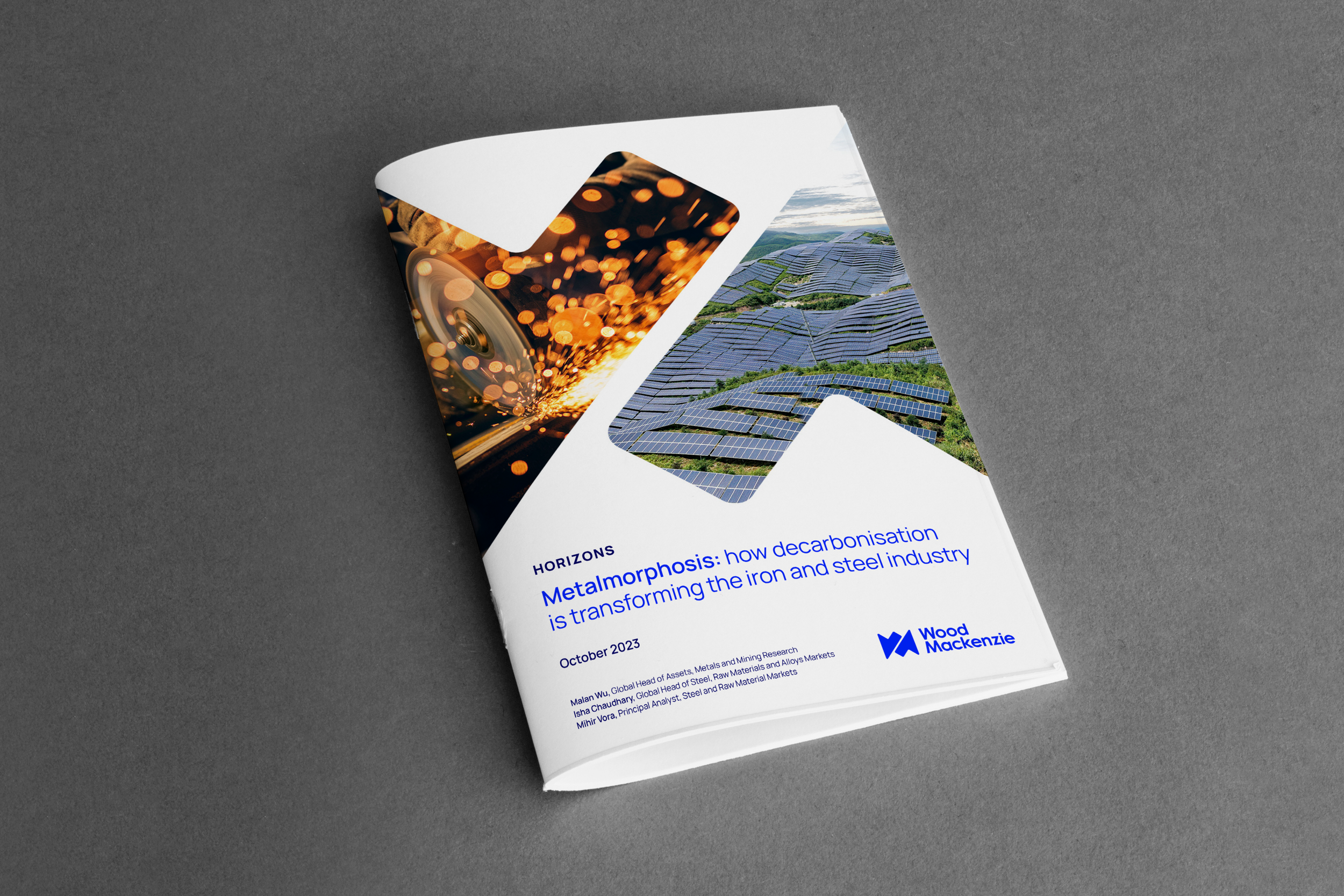
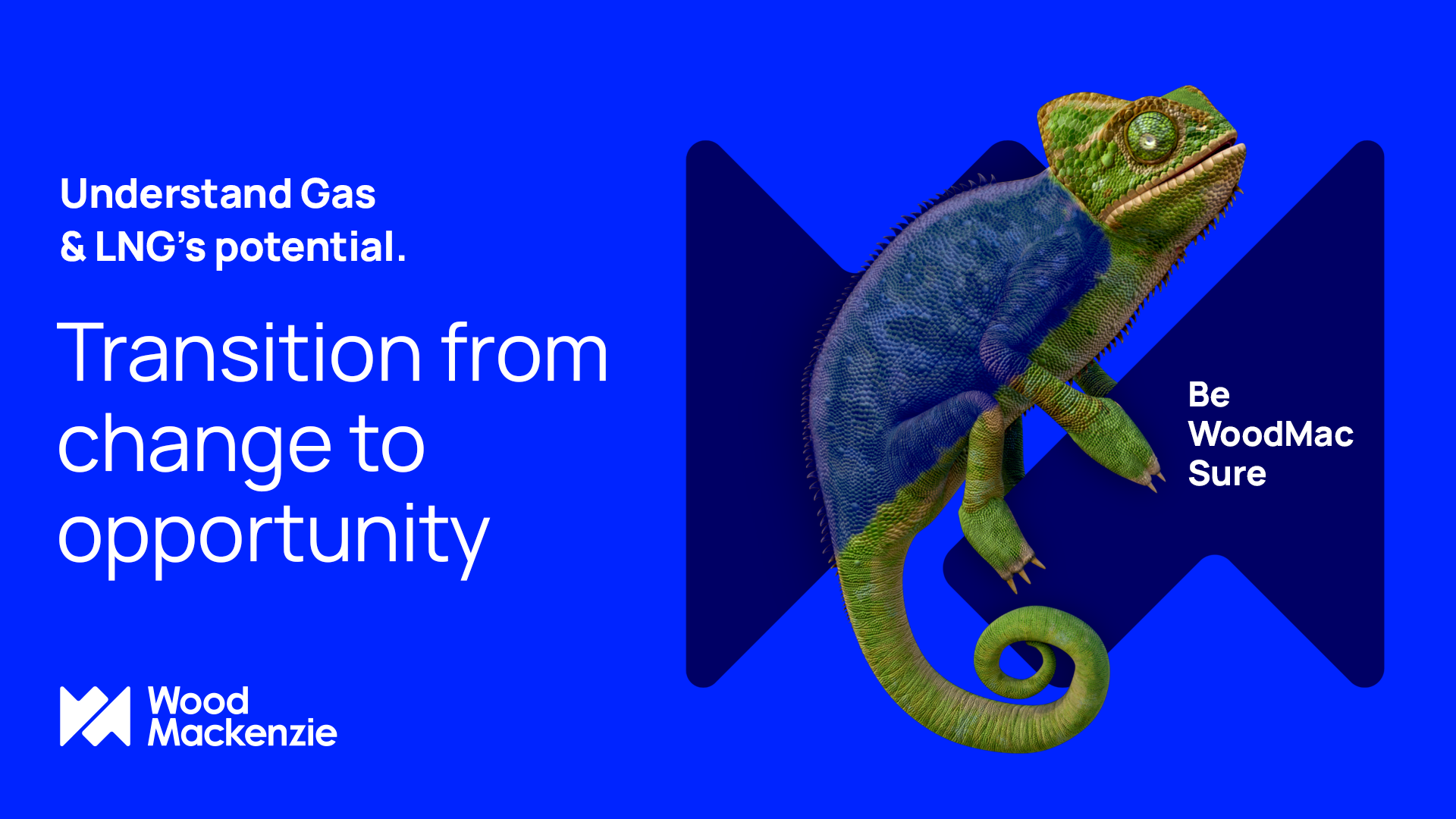
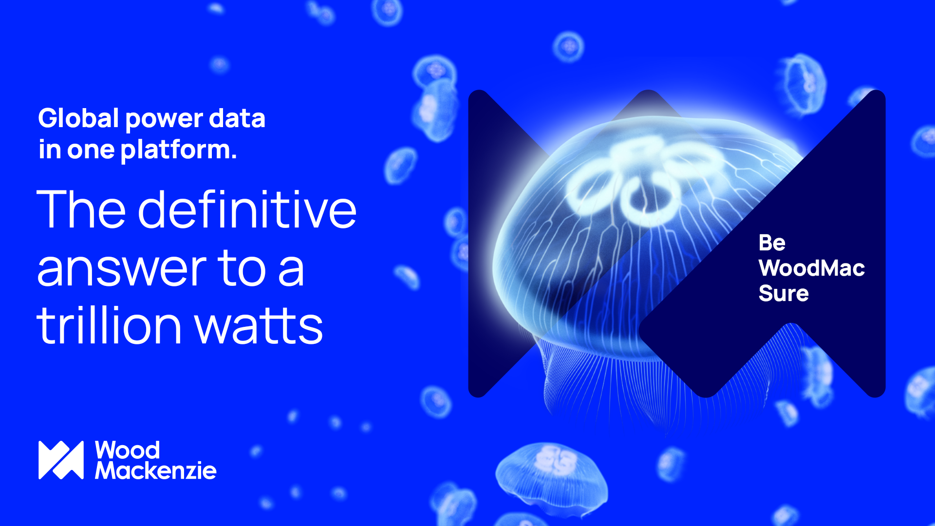
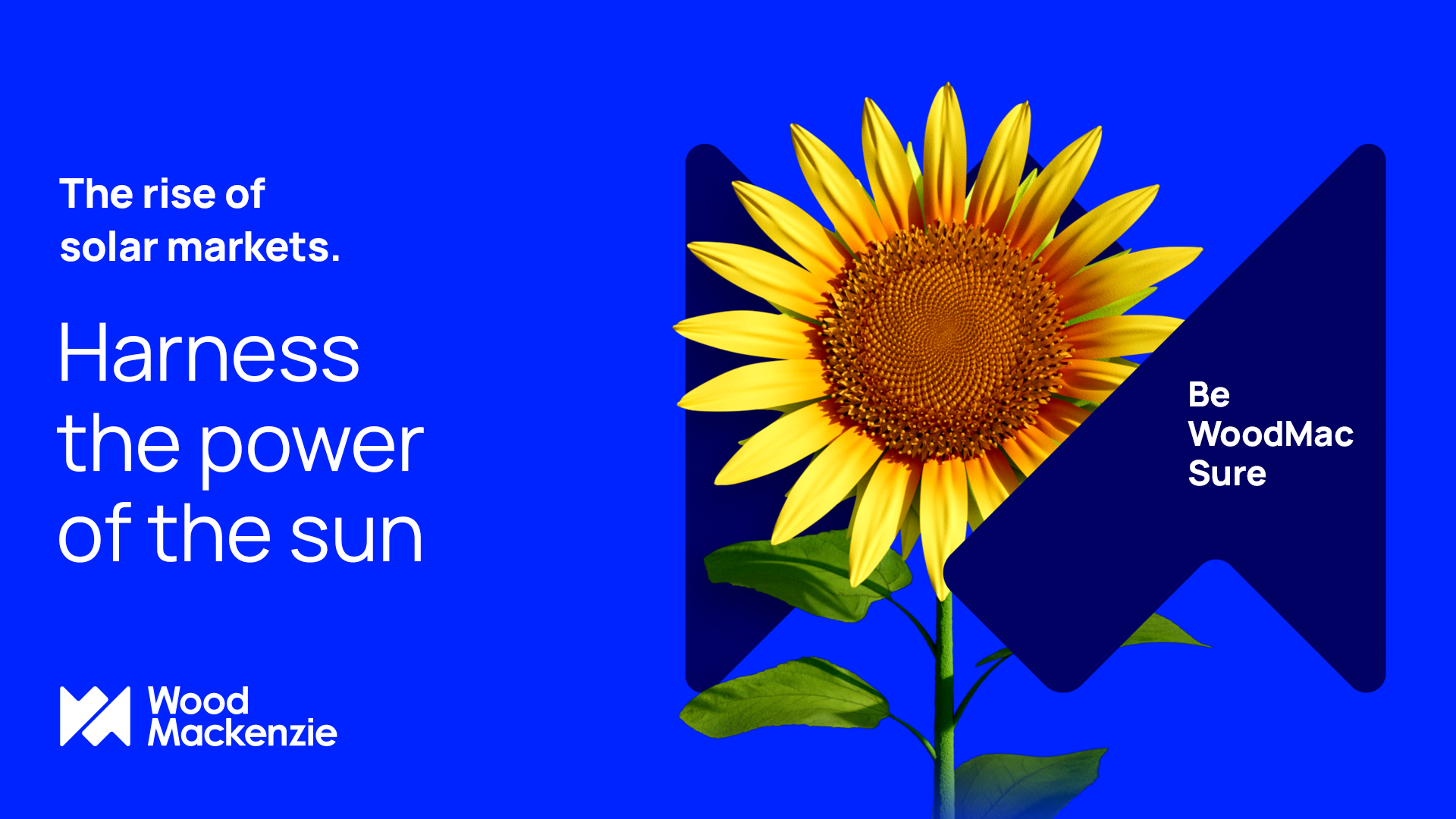
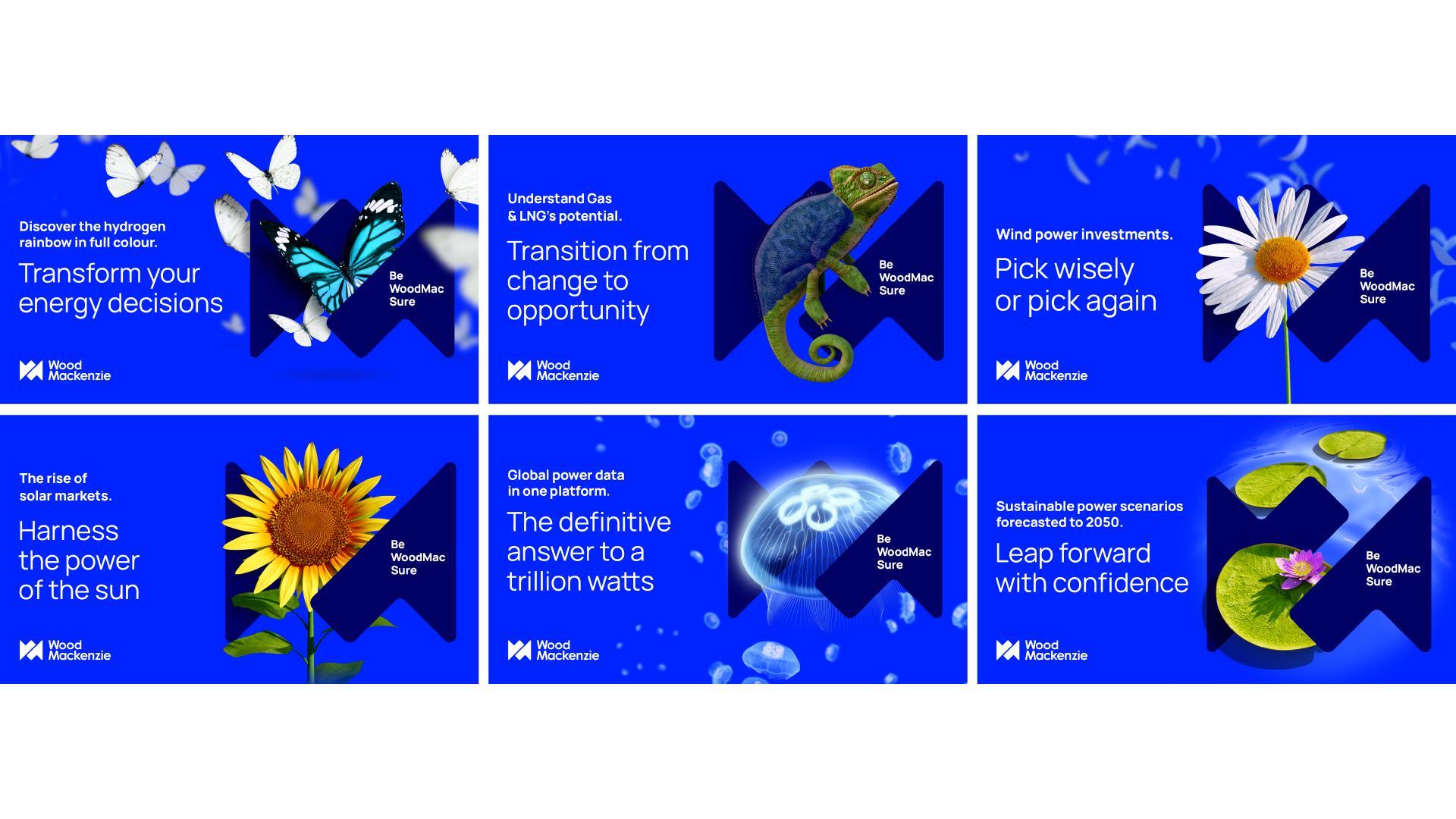
Horizons

Be WoodMac Sure
brand campaign 23/24
Creative Direction: Emma Lamont & Craig Unsworth
Animation: Steve Robertson-Pool & Matt O’Donnal
Brand Team: Helen Mckenzie, Nick Dudman, Victoria Cameron, Amelia Timberlake
Agency: Earnest, Monumentum & internal team
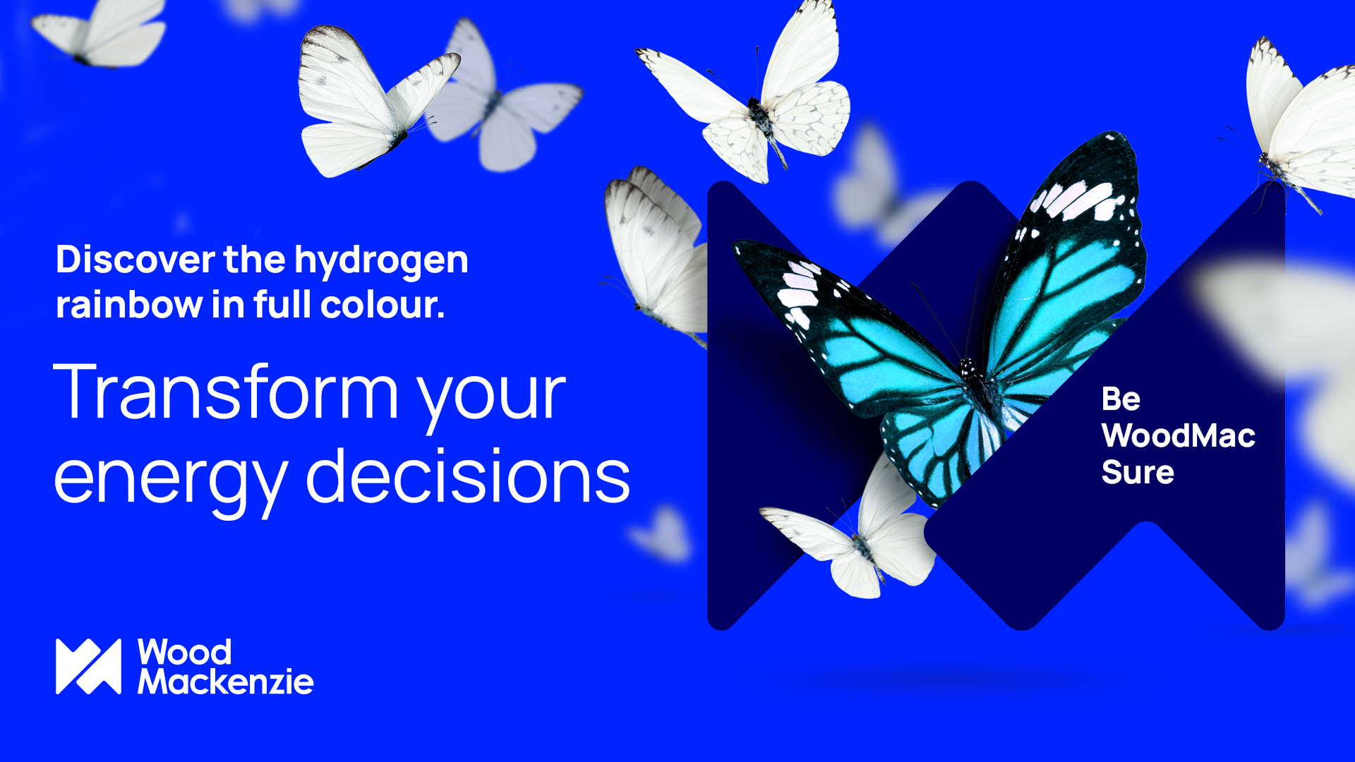
Becoming the go-to brand for energy intelligence.
Be WoodMac Sure.
The opportunity to leverage our new brand to disrupt the energy data sector.
The solution
Using our cobalt brand colour to achieve strong, vibrant standout across platforms such as LinkedIn and Google ads, using both static and animated assets. Using the ‘natural world’ as inspiration for our key imagery and linking that to the various energy sectors via language. For example, a sunflower for solar as they use the sun to grow, a glowing jellyfish to represent electricity, petals blowing in the wind for wind power. This takes our brand away from cliché imagery that saturates the sector, and which all of our competitors use, helping us be noticed and create intrigue in the mind of the client.

Exhibition design

Who is Wood Mackenzie?
The opportunity to experience WoodMac intelligence at various third party events.
The solution
Because WoodMac is about taking complicated data and analytics and making them clear and understandable, I wanted to create a clean, clear stand that visually represents what we do.
I worked with the events team to determine what the overall goal of the events was and what products they wished to showcase. I used that information to determine the key messaging needed and the type of seating and screens required.
Another consideration was creating assets that could be reused in line with our company’s minimal-waste policy.
Outcome
An uncluttered stand that has our new brand at the forefront. Leading with our graphic property (the icon from the WoodMac logo) and putting that at the heart of the stand in our distinctive cobalt colour. Using cobalt as highlights on things like side panels and banners. Replacing pull-up banners with a reuseable stand that means just the graphic section needs to be replaced for different events, rather than the whole roll up banner thrown away.
Screens on the side panel without messaging allows for these side panels to be reused when possible, or, at least, speed up design time by not changing messaging on side panels for every event, saving internal design time and creating consistency across events. The screens also allow more interactivity, and open up conversations with the events team present at the show. The large table in the middle allows us to create a ‘workshop’ environment, with drop-in demonstration areas and encourages people to ask for a walk through of our products or a live demo. The TV screen is placed on the right-hand side of this example and would have a product reel on a loop. Because the main walkway of the event is down the right-hand side of this stand, I changed the position of the TV so it would help catch people’s attention and draw them to the stand.
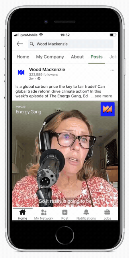
Podcasts
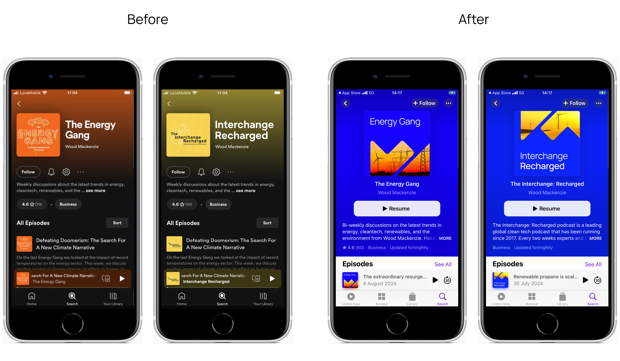
Two podcasts, one brand.
Bringing our podcasts under the new WoodMac brand.
Background
WoodMac has two podcasts that had a completely unique look and feel to each one. Over time, the colours for the podcast were recognisable to each of the podcasts. When WoodMac rebranded, we had to bring the two, very different, very colour led podcasts into the new brand identity whist still pulling them apart.
The solution
Leading with our core cobalt colour, I then investigated how we could bring the different podcast colours into the different identities. We our graphic property is always used as a solid colour of either the cobalt or white or contains an energy sector based image.
The solution was to add a very colour heavy sector image into the graphic property to echo the old brand but bring it into the new branding.
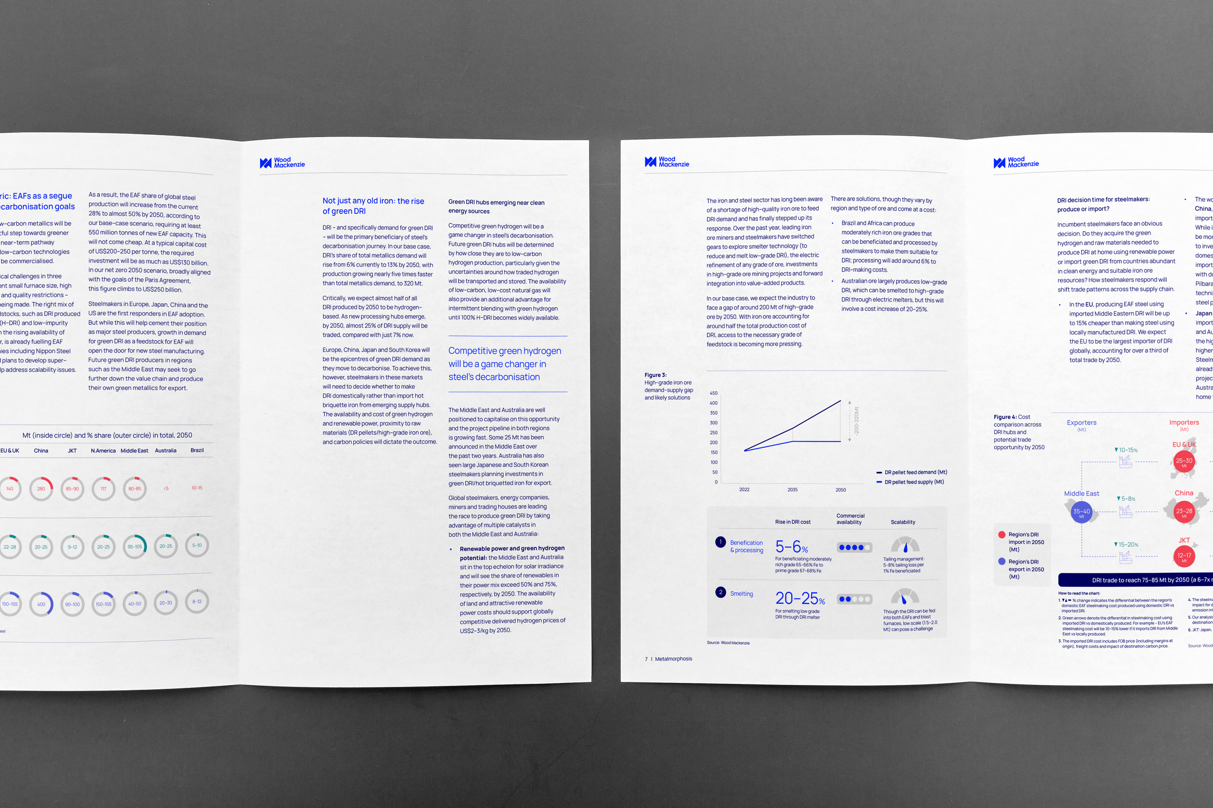
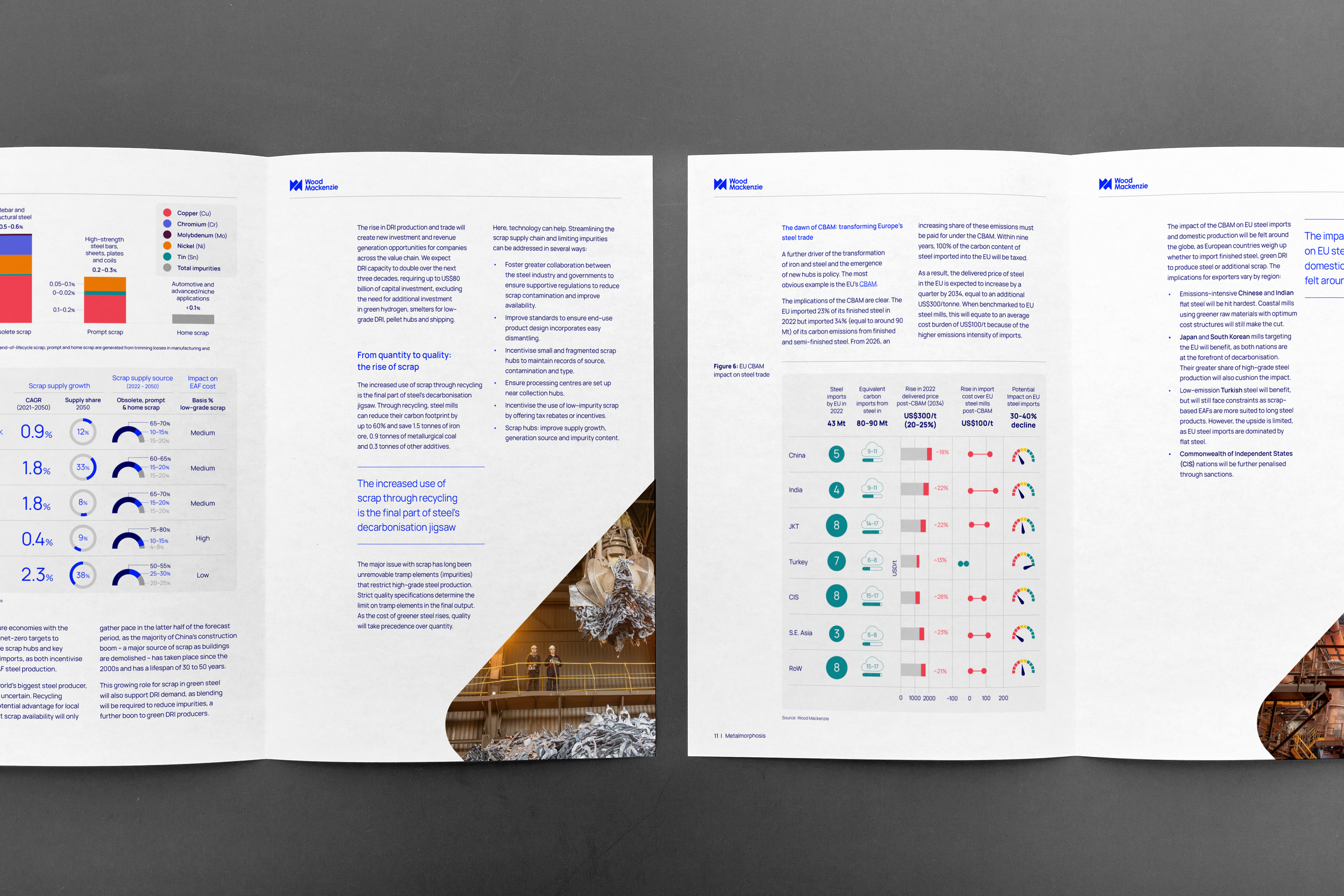
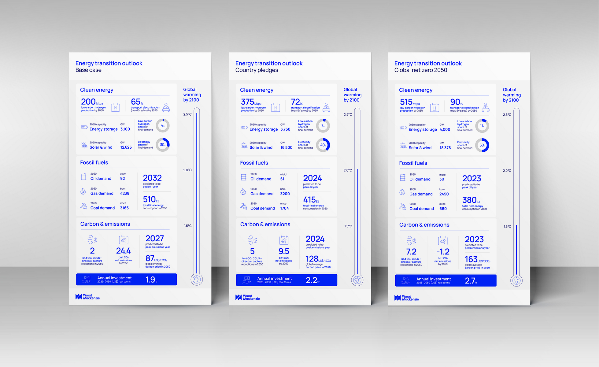
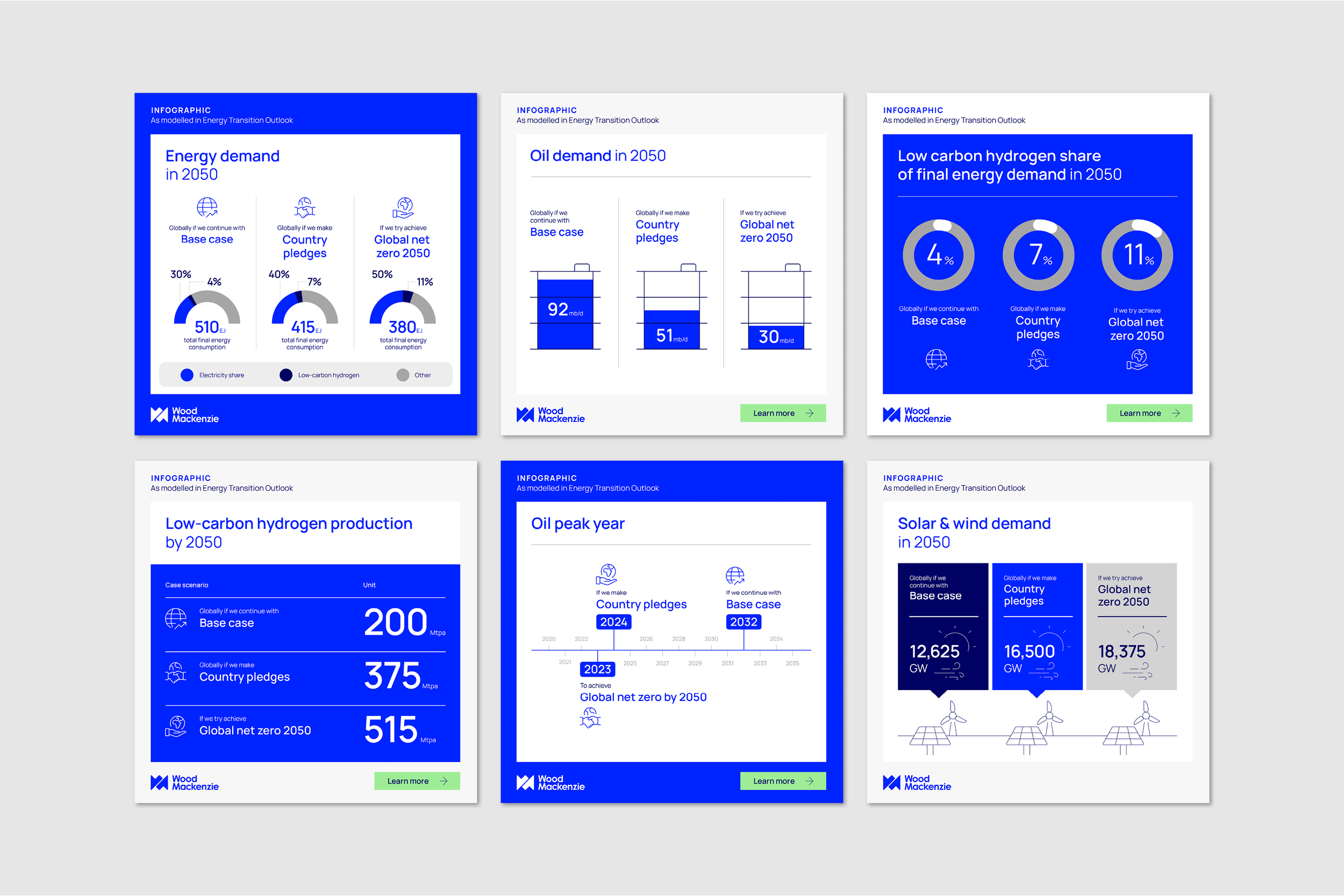
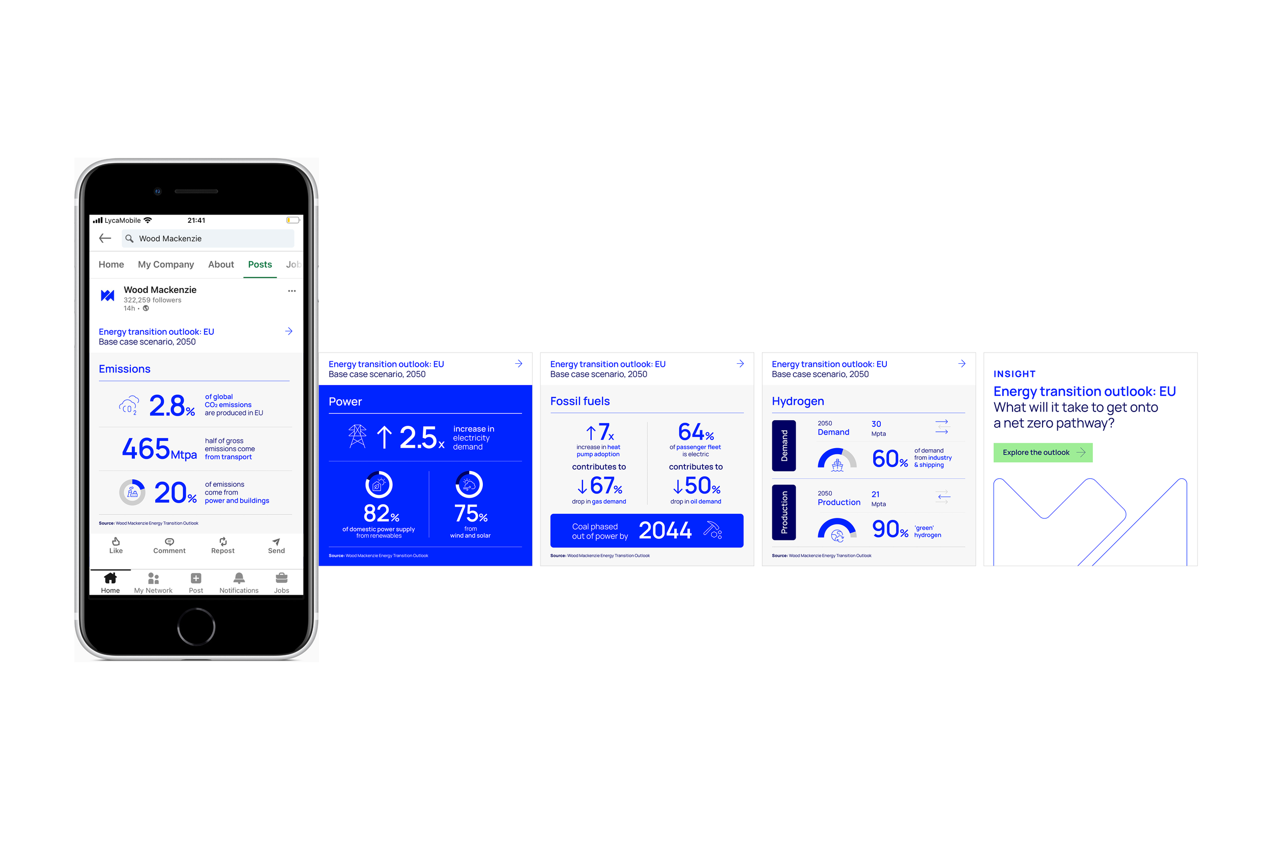
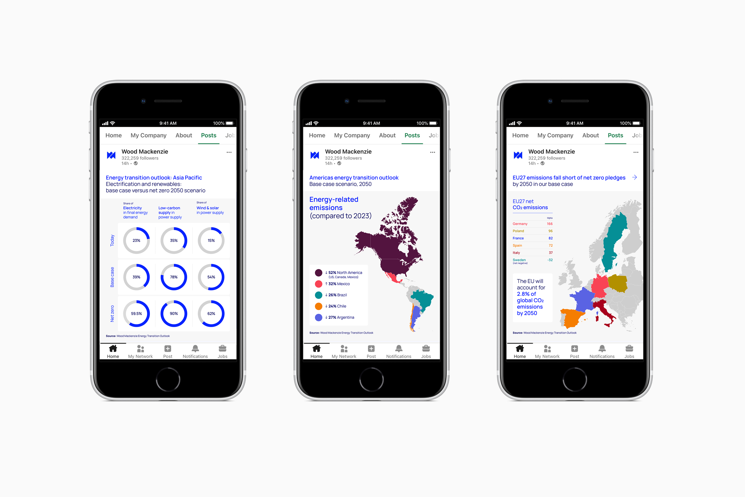
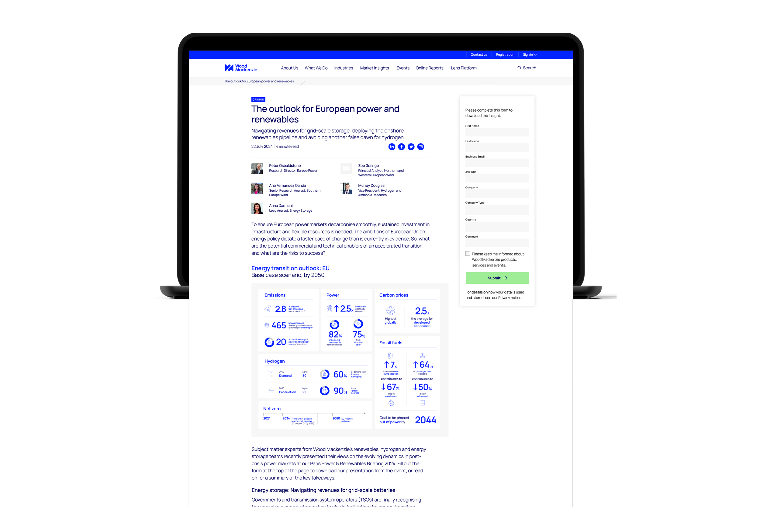
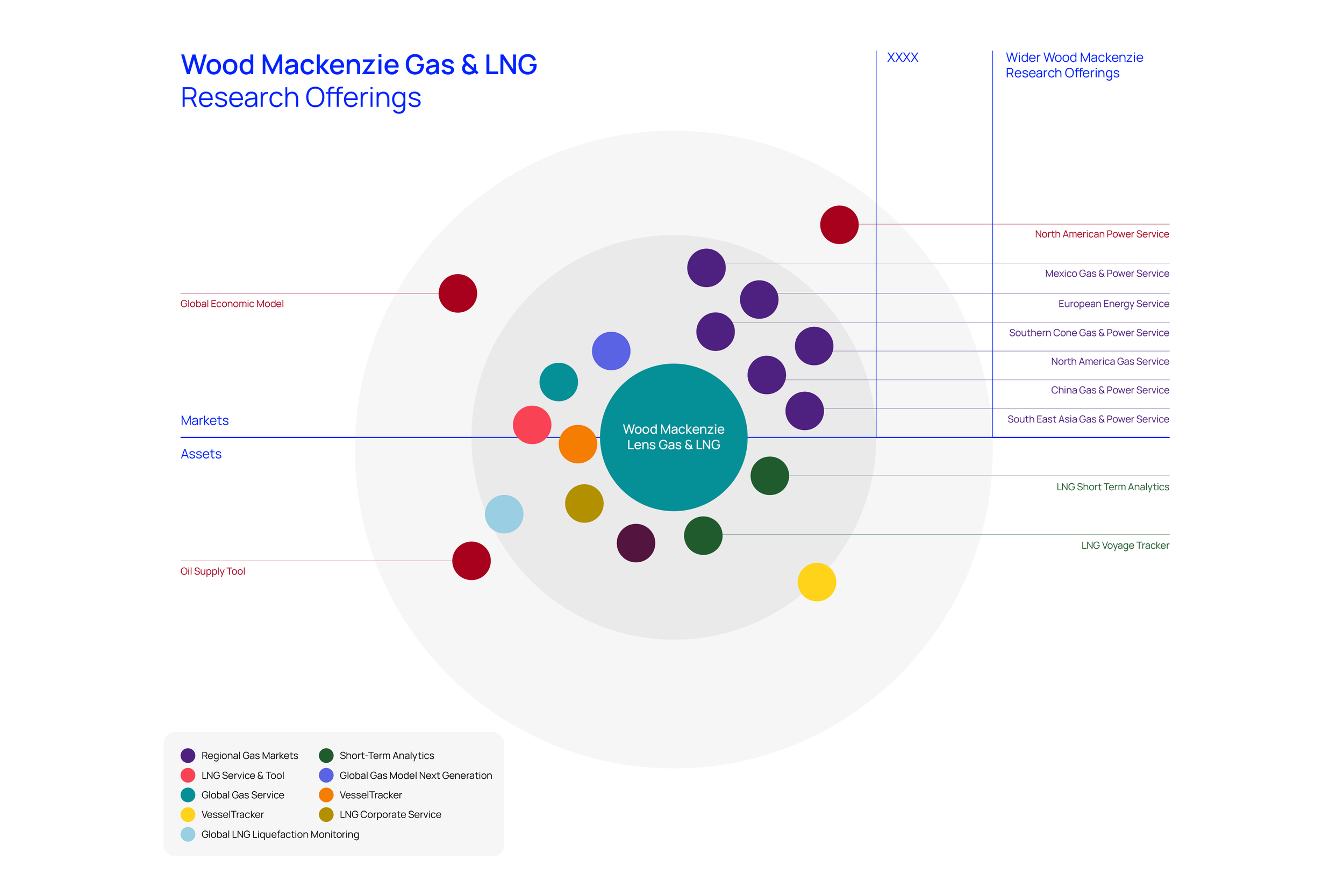
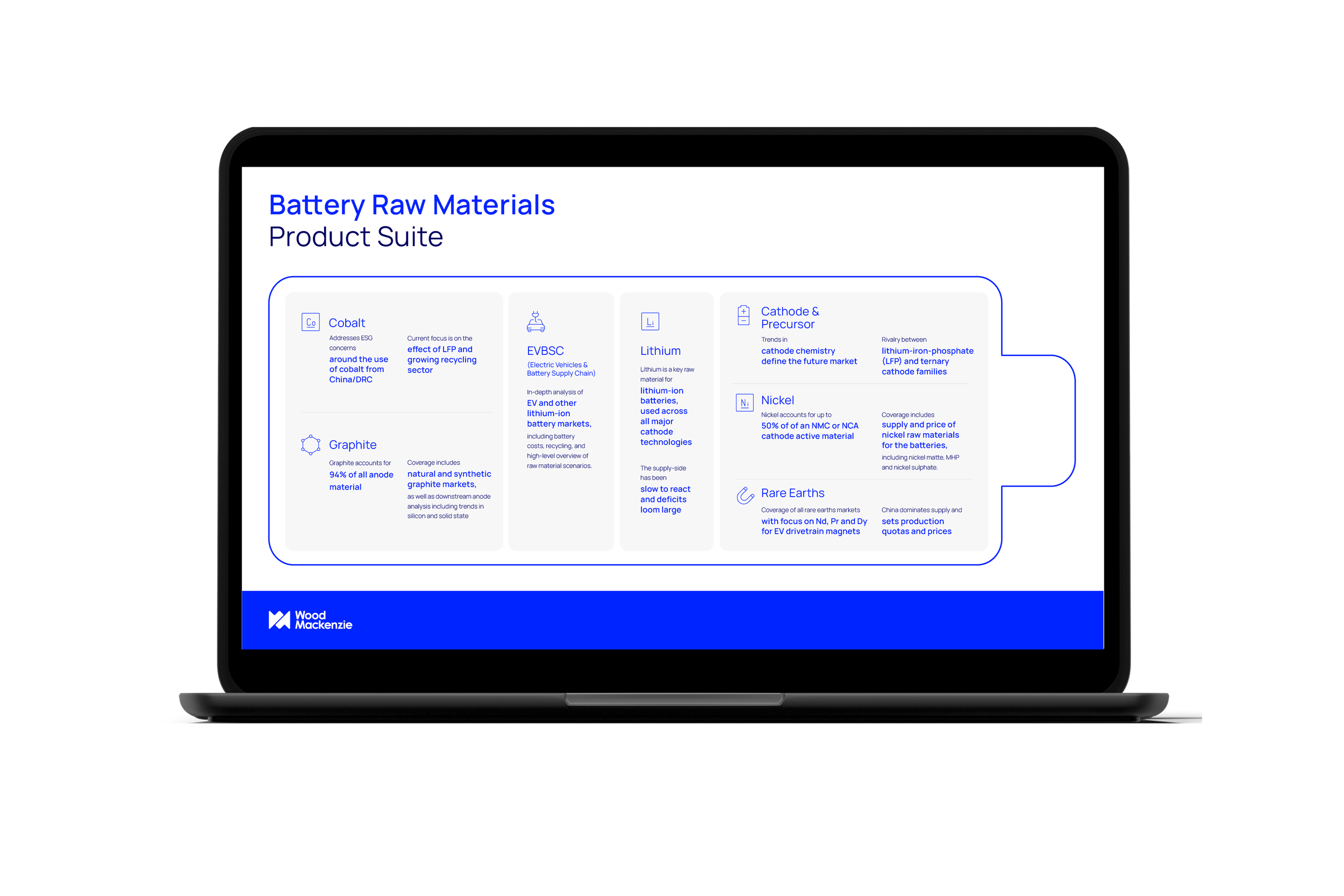
Infographics
Motion graphics
Storyboarding various motion graphics work and working with
the motion designers to bring the vision to life

Horizons